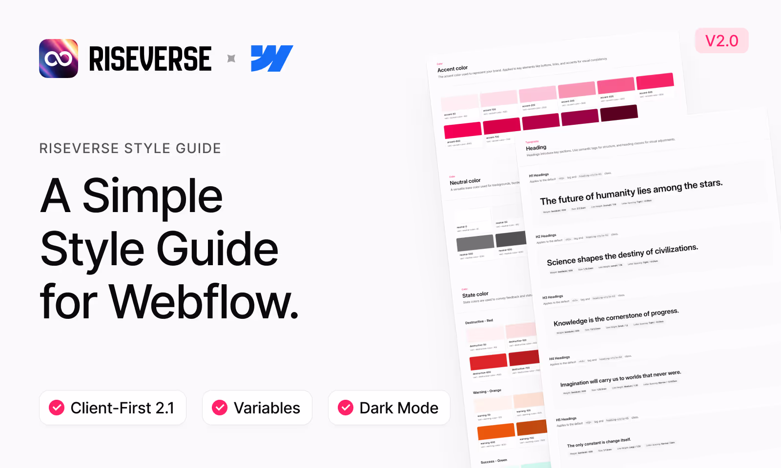
Accent color
The accent color used to represent your brand. Applied to key elements like buttons, links, and accents for visual consistency.
Neutral color
A versatile base color used for backgrounds, borders, and text. Supports layout structure without drawing attention.
State color
State colors are used to convey feedback and status—red for destructive actions, orange for warnings, green for success, and blue for informational messages.
Destructive
Warning
Success - Green
Information - Blue
Static color
Static colors are used for UI elements that don’t change state, providing consistent visual structure without implying interactivity or status.
Heading
Headings introduce key sections. Use semantic tags for structure, and heading classes for visual adjustments.
H1 Headings
Applies to the default <h1> tag and heading-style-h1 class.
The future of humanity lies among the stars.
H2 Headings
Applies to the default <h2> tag and heading-style-h2 class.
Science shapes the destiny of civilizations.
H3 Headings
Applies to the default <h3> tag and heading-style-h3 class.
Knowledge is the cornerstone of progress.
H4 Headings
Applies to the default <h4> tag and heading-style-h4 class.
Imagination will carry us to worlds that never were.
H5 Headings
Applies to the default <h5> tag and heading-style-h5 class.
The only constant is change itself.
H6 Headings
Applies to the default <h6> tag and heading-style-h6 class.
Yesterday's fiction is tomorrow's reality.
Paragraph
Designed for readable, multi-line content. Use sizes classes when typography size don’t match default paragraph tags.
XLarge Text
Applies to the text-size-xlarge class.
Transform your development workflow with our comprehensive suite of tools and services designed for modern teams.
Large Text
Applies to the text-size-large class.
Build, test, and deploy with confidence using our integrated development environment that adapts to your team's needs.
Medium Text
Applies to the default <p> tag and text-size-medium class for standard <body> text.
Collaborate seamlessly with your team through real-time editing, version control, and automated workflow management.
Small Text
Applies to the text-size-small class.
Access powerful development tools and resources designed to enhance productivity and streamline your workflow.
XSmall Text
Applies to the text-size-xsmall class.
Stay up to date with continuous updates and improvements to our development platform.
Subheading
Subheadings help organize content into smaller sections, making pages easier to scan and understand.
Medium Subheading
Applies to the subheading-size-medium class.
FEATURED PRODUCTS
Small Subheading
Applies to the subheading-size-small class.
CATEGORY • DATE
XSmall Subheading
Applies to the subheading-size-xsmall class.
TESTIMONIALS
Text weight
Font weight classes let you customize emphasis when semantic tags don’t align with visual styling.
Bold
Applies to the text-weight-bold class.
Collaborate seamlessly with your team through real-time editing, version control, and automated workflow management.
Semibold
Applies to the text-weight-semibold class.
Access powerful development tools and resources designed to enhance productivity and streamline your workflow.
Medium
Applies to the text-weight-medium class.
Transform your development workflow with our comprehensive suite of tools and services designed for modern teams.
Regular
Applies to the text-weight-regular class.
Build, test, and deploy with confidence using our integrated development environment that adapts to your team's needs.
Text style
Style classes for adjusting text appearance when it doesn’t align with the default HTML tag.
Underline
Applies to the text-style-underline class.
Collaborate seamlessly with your team through real-time editing, version control, and automated workflow management.
Strike-through
Applies to the text-style-strikethrough class.
Collaborate seamlessly with your team through real-time editing, version control, and automated workflow management.
Italic
Applies to the text-style-italic class.
Collaborate seamlessly with your team through real-time editing, version control, and automated workflow management.
All caps
Applies to the text-style-allcaps class.
Collaborate seamlessly with your team through real-time editing, version control, and automated workflow management.
No wrap
Applies to the text-style-nowrap class.
No wrap
1 line
Applies to the text-style-1line class.
Collaborate seamlessly with your team through real-time editing, version control, and automated workflow management. Access powerful development tools and resources designed to enhance productivity and streamline your workflow.
2 lines
Applies to the text-style-2lines class.
Collaborate seamlessly with your team through real-time editing, version control, and automated workflow management. Access powerful development tools and resources designed to enhance productivity and streamline your workflow.
3 lines
Applies to the text-style-3lines class.
Collaborate seamlessly with your team through real-time editing, version control, and automated workflow management. Access powerful development tools and resources designed to enhance productivity and streamline your workflow. Stay up to date with continuous updates and improvements to our development platform.
Heading font
Applies to the text-style-heading class.
Collaborate seamlessly with your team through real-time editing, version control, and automated workflow management.
Text font
Applies to the text-style-text class.
Collaborate seamlessly with your team through real-time editing, version control, and automated workflow management.
Text alignement
Utility classes for aligning text left, center, or right. Useful for controlling layout and readability across different screen sizes.
Align left
Applies to the text-align-left class.
Collaborate seamlessly with your team through real-time editing, version control, and automated workflow management.
Align center
Applies to the text-align-center class.
Collaborate seamlessly with your team through real-time editing, version control, and automated workflow management.
Align right
Applies to the text-align-right class.
Collaborate seamlessly with your team through real-time editing, version control, and automated workflow management.
Text color
Used to change the color of text and icon elements for contrast, emphasis, or visual hierarchy.
Text primary
Applies to the text-color-primary class.
Collaborate seamlessly with your team through real-time editing, version control, and automated workflow management.
Text secondary
Applies to the text-color-secondary class.
Collaborate seamlessly with your team through real-time editing, version control, and automated workflow management.
Text tertiary
Applies to the text-color-tertiary class.
Collaborate seamlessly with your team through real-time editing, version control, and automated workflow management.
Text quaternary
Applies to the text-color-quaternary class.
Collaborate seamlessly with your team through real-time editing, version control, and automated workflow management.
Text accent
Applies to the text-color-accent class.
Collaborate seamlessly with your team through real-time editing, version control, and automated workflow management.
Text destructive
Applies to the text-color-destructive class.
Collaborate seamlessly with your team through real-time editing, version control, and automated workflow management.
Text warning
Applies to the text-color-warning class.
Collaborate seamlessly with your team through real-time editing, version control, and automated workflow management.
Text success
Applies to the text-color-success class.
Collaborate seamlessly with your team through real-time editing, version control, and automated workflow management.
Text information
Applies to the text-color-information class.
Collaborate seamlessly with your team through real-time editing, version control, and automated workflow management.
Rich text
Use Rich Text for CMS-driven or editorial content. It applies system-wide styles to all nested text elements.
Text rich text (Default)
Applies to the text-rich-text class.
Typography shapes how we read
Typography plays a key role in how users experience content. It's not just decoration — it affects understanding, retention, and behavior.
Visual hierarchy drives attention
Designers use font size, weight, and spacing to guide the reader’s eye. Clear hierarchy helps users scan information quickly and focus on what matters most.
Readability over aesthetics
Great design prioritizes readability over visual flair. A simple, well-spaced typeface is often more effective than a decorative one.
Inline elements matter
Small details like links and inline code snippets can improve clarity when styled consistently.
Typography in practice
Use consistent font sizes, spacing, and alignment. Keep headings clear, body text readable, and limit font variations. Good typography makes content easier to read — not just nicer to look at.
Don’t overlook the details
Typography also involves subtle elements like superscript references (e.g. 10km2 = 10,000m2) or chemical symbols such as H2O.
"Typography is the craft of endowing human language with a durable visual form." — Robert Bringhurst
Key principles of readable typography
- Use a consistent type scale.
- Establish a strong visual hierarchy.
- Apply adequate contrast between text and background.
Common typography mistakes
- Using too many fonts
- Forgetting to set line-height
- Center-aligning long blocks of text
Typography isn't just visual — it's functional. Make it easy to read, and your content becomes easier to trust.
Blockquote
Use blockquote to format quotations or excerpts. It helps distinguish them from surrounding text.
Neutral (Default)
Applies to all <blockquote> tag.
"Typography is the craft of endowing human language with a durable visual form." — Robert Bringhurst
List
Used to organize content in a vertical list. Supports both numbered and bulleted formats.
Unordered list
Applies to all <ul> element.
- Using too many fonts
- Forgetting to set line-height
- Center-aligning long blocks of text
Ordered list
Applies to all <ol> element.
- Use a consistent type scale.
- Establish a strong visual hierarchy.
- Apply adequate contrast between text and background.
Button
Buttons represent clickable actions. Use consistent styles to indicate priority and interactivity.
Accent (Default)
Applies to the button, is-secondary, is-tertiary, and is-text classes.
Neutral
Applies to the is-neutral class.
Destructive
Applies to the is-destructive class.
Disabled
Applies to the is-disabled class.
Sizes
Applies to the is-small, is-xsmall, and is-2xsmall classes.
With icon
Applies to the is-icon-only class.
Full width
Applies to the is-full-width class.
Compact button
Compact buttons are ideal for tight spaces and UI controls. Commonly used to close modals or toggle sidebars.
Compact (Default)
Applies to the is-compact class.
Secondary
Applies to the is-secondary class.
Size
Applies to the is-small class.
Rounded
Applies to the is-rounded class.
Disabled
Applies to the is-disabled class.
Link button
Link buttons trigger actions or navigation while styled as hyperlinks. Use for lightweight, inline actions that don’t require button prominence.
Accent (Default)
Applies to the is-link class.
Secondary
Applies to the is-secondary class.
Tertiary
Applies to the is-tertiary class.
Underline
Applies to the is-underline class.
Small
Applies to the is-small class.
Disabled
Applies to the is-disabled class.
Social button
Social buttons connect with third-party platforms to speed up login, registration, or sharing actions.
Apple
X (Twitter)
Github
Link
Used to navigate between pages or sections. Links are styled text elements without the visual emphasis of buttons.
Tag
Tags are small label elements used to categorize, highlight, or identify content within a layout.
Outline (Default)
Applies to the tag_component class.
Secondary
Applies to the is-secondary class.
Disabled
Applies to the is-disabled class.
Drowdown
Dropdowns reveal hidden content or actions when triggered. Useful for menus, filters, or compact option lists.
Outline (Default)
Applies to the dropdown_component class.
Secondary
Applies to the is-secondary class.
Sizes
Applies to the is-small, is-xsmall, and is-2xsmall classes.
Tabs
Used to navigate between pages or sections. Links are styled text elements without the visual emphasis of buttons.
As Tabs
Applies to the tabs_component class.
Segmented Control
Segmented controls let users choose one option from a set. Ideal for switching views, filters, or settings within the same context.
As Tabs
Applies to the segmented-control_component class.
As Button
Uses buttons instead of default tabs. Ideal to trigger custom interaction.
Small
Applies to the is-small class.
Form block
Segmented controls let users choose one option from a set. Ideal for switching views, filters, or settings within the same context.
Form component
Applies to the form_component, form_form, form_message-success and form_message-error classes.
Text input
The Text Input is a form field used to collect short text responses from users, such as names, emails, or search queries.
Text input (Default)
Applies to the form_input class.
With icon
Applies to the form_input-wrapper class.
Sizes
Applies to the is-small and is-xsmall classes.
Disabled
Applies to the is-disabled class.
Text area
The Text Area is a form field used for longer text input, ideal for messages, comments, or multi-line responses.
Text area (Default)
Applies to the is-text-area class.
Disabled
Applies to the is-disabled class.
Select
The Select Input lets users choose a single option from a dropdown list. Ideal for predefined choices like categories, locations, or settings.
Select (Default)
Applies to the select_component class.
Size
Applies to the is-small and is-xsmall classes.
Disabled
Applies to the is_disabled class.
Checkbox
The Checkbox allows users to select one or more options from a list. Ideal for toggles, preferences, or multi-select choices.
Checkbox (Default)
Applies to the form_checkbox class.
Radio
The Radio Button lets users select one option from a group. Ideal for single-choice questions where only one answer is allowed.
Radio (Default)
Applies to the form_radio class.
Badge
Badges are small visual indicators used to highlight counts, statuses, or labels—often paired with icons, buttons, or list items.
Neutral (Default)
Applies to the badge_component class.
State colors
Applies to the is-accent , is-destructive , is-warning, is-successand is-information classes.
Secondary
Applies to the is-secondary class.
Disabled
Applies to the is-disabled class.
Status badge
Status Badges display the current state of an item—such as active, offline, or pending—using color and label cues for quick recognition.
Disabled (Default)
Applies to the status-badge_component class.
Status
Applies to the is-failed , is-pending, is-completed classes.
Secondary
Applies to the is-secondary class.
Tooltip
Tooltips provide brief, contextual information when users hover over or focus on an element—helping clarify actions or content without cluttering the interface.
Top (Default)
Applies to the tooltip_component class.
Tooltip component content
Positions
Applies to the is-left , is-right and is-bottom classes.
Left aligned Tooltip content
Top aligned Tooltip content
Right aligned Tooltip content
Bottom aligned Tooltip content
Icon size
Icon size defines how large an icon appears, helping maintain visual consistency across the interface.
Sizes
Applies to the icon-1x1-[size] classes.
class Name | Value | Icon |
|---|---|---|
icon-1x1-tiny | 0.625rem | |
icon-1x1-3xsmall | 0.875rem | |
icon-1x1-2xsmall | 1rem | |
icon-1x1-xsmall | 1.125rem | |
icon-1x1-small | 1.25rem | |
icon-1x1-medium | 1.5rem | |
icon-1x1-large | 1.75rem | |
icon-1x1-xlarge | 2rem | |
icon-1x1-2xlarge | 2.5rem |
Shadow
Shadow adds depth to elements, helping separate them from the background and create visual hierarchy.
Large
Applies to the shadow-xsmall class.
Medium
Applies to the shadow-xsmall class.
Small
Applies to the shadow-xsmall class.
XSmall
Applies to the shadow-xsmall class.
Radius
Radius controls the roundness of element corners, affecting the overall shape and visual softness of components.
Sizes
Applies to the var(--_layout---radius--[size]) variables.
Variable Name | Value | Example |
|---|---|---|
var(--_layout---radius--none) | 0rem | |
var(--_layout---radius--3xsmall) | 0.125rem | |
var(--_layout---radius--2xsmall) | 0.25rem | |
var(--_layout---radius--xsmall) | 0.375rem | |
var(--_layout---radius--small) | 0.5rem | |
var(--_layout---radius--medium) | 0.625rem | |
var(--_layout---radius--large) | 0.75rem | |
var(--_layout---radius--xlarge) | 1rem | |
var(--_layout---radius--2xlarge) | 1.25rem | |
var(--_layout---radius--3xlarge) | 1.5rem | |
var(--_layout---radius--4xlarge) | 1.75rem | |
var(--_layout---radius--full) | 9999rem |
Border width
Border width controls the thickness of borders, helping adjust visual weight and clarity in UI elements.
Sizes
Applies to the var(--_layout---border-width--[size]) variables.
Variable Name | Value | Example |
|---|---|---|
var(--_layout---border-width--small) | 1px | |
var(--_layout---border-width--medium) | 0.125rem | |
var(--_layout---border-width--large) | 0.25rem |
Spacing
Spacing defines the margin and padding around elements, ensuring consistent layout, alignment, and visual rhythm across the interface.
Sizes
Applies to the var(--_layout---spacing--[size]) variables.
Variable Name | Value | Example |
|---|---|---|
var(--_layout---spacing--none) | 0rem | |
var(--_layout---spacing--3xsmall) | 0.125rem | |
var(--_layout---spacing--2xsmall) | 0.25rem | |
var(--_layout---spacing--xsmall) | 0.375rem | |
var(--_layout---spacing--small) | 0.5rem | |
var(--_layout---spacing--medium) | 0.625rem | |
var(--_layout---spacing--large) | 0.75rem | |
var(--_layout---spacing--xlarge) | 0.875rem | |
var(--_layout---spacing--2xlarge) | 1rem | |
var(--_layout---spacing--3xlarge) | 1.25rem | |
var(--_layout---spacing--4xlarge) | 1.5rem | |
var(--_layout---spacing--5xlarge) | 2rem | |
var(--_layout---spacing--6xlarge) | 2.5rem | |
var(--_layout---spacing--7xlarge) | 3rem | |
var(--_layout---spacing--8xlarge) | 3.5rem | |
var(--_layout---spacing--9xlarge) | 4rem | |
var(--_layout---spacing--10xlarge) | 5rem |
Structure
Structure classes like page-wrapper, main-wrapper, container-size, padding-section-size, and button-group help define the layout, spacing, and alignment of sections and components for a consistent page structure.
Page wrapper
Applies to the page-wrapper class.
Main wrapper
Applies to the main-wrapper class.
Container xsmall
Applies to the container-xsmall class.
Container small
Applies to the container-small class.
Container medium
Applies to the container-medium class.
Container large
Applies to the container-large class.
Container xlarge
Applies to the container-xlarge class.
Padding global
Applies to the padding-global class.
Padding section xmall
Applies to the padding-section-xsmall class.
Padding section small
Applies to the padding-section-small class.
Padding section medium
Applies to the padding-section-medium class.
Padding section large
Applies to the padding-section-large class.
Padding section xlarge
Applies to the padding-section-xlarge class.
Padding section 2xlarge
Applies to the padding-section-2xlarge class.
Button group
Applies to the button-group class.
Max width
Max width classes limit the maximum width of elements to maintain readable line lengths and consistent content alignment across different screen sizes.
2XSmall
Applies to the max-width-2xsmall class.
XSmall
Applies to the max-width-xsmall class.
Small
Applies to the max-width-small class.
Medium
Applies to the max-width-medium class.
Large
Applies to the max-width-large class.
XLarge
Applies to the max-width-xlarge class.
2XLarge
Applies to the max-width-2xlarge class.
Full
Applies to the max-width-full class.
Full tablet
Applies to the max-width-full-tablet class.
Full mobile landscape
Applies to the max-width-full-mobile-landscape class.
Full mobile portrait
Applies to the max-width-full-mobile-portrait class.
Padding
Padding direction and size classes control the inner spacing of elements on specific sides—top, right, bottom, or left—to create consistent spacing and layout flow.
Directions
Applies to the padding-[direction] classes.
Class Name | Example |
|---|---|
padding-bottom | |
padding-top | |
padding-vertical | |
padding-horizontal | |
padding-left | |
padding-right |
Sizes
Applies to the padding-[size] classes.
Class Name | Value | Example |
|---|---|---|
padding-0 | 0rem | |
padding-3xsmall | 0.125rem | |
padding-2xsmall | 0.25rem | |
padding-xsmall | 0.375rem | |
padding-small | 0.5rem | |
padding-medium | 0.625rem | |
padding-large | 0.75rem | |
padding-xlarge | 0.875rem | |
padding-2xlarge | 1rem | |
padding-3xlarge | 1.5rem | |
padding-4xlarge | 2rem | |
padding-5xlarge | 2.5rem | |
padding-6xlarge | 3rem |
Margin
Margin direction and size classes control the outer spacing of elements on specific sides, helping manage layout separation and alignment across components.
Directions
Applies to the margin-[direction] classes.
Class Name | Example |
|---|---|
margin-bottom | |
margin-top | |
margin-vertical | |
margin-horizontal | |
margin-left | |
margin-right |
Sizes
Applies to the margin-[size] classes.
Class Name | Value | Example |
|---|---|---|
margin-0 | 0rem | |
margin-3xsmall | 0.125rem | |
margin-2xsmall | 0.25rem | |
margin-xsmall | 0.375rem | |
margin-small | 0.5rem | |
margin-medium | 0.625rem | |
margin-large | 0.75rem | |
margin-xlarge | 0.875rem | |
margin-2xlarge | 1rem | |
margin-3xlarge | 1.5rem | |
margin-4xlarge | 2rem | |
margin-5xlarge | 2.5rem | |
margin-6xlarge | 3rem |
Utility
Utility classes for common behaviors like visibility, z-index, overflow, pointer events, and aspect ratio—helpful for handling layout and interaction quickly and consistently.
Useful classes
Class Name | Example |
|---|---|
theme-dark | |
hide | |
hide-tablet | |
hide-mobile-landscape | |
hide-mobile-portrait | |
overflow-visible | |
overflow-hidden | |
overflow-auto | |
overflow-scroll | |
pointer-events-auto | |
pointer-events-none | |
layer | |
spacing-clean | |
align-center | |
z-index-1 | |
z-index-2 | |
inherit-color | |
aspect-ratio-square | |
aspect-ratio-portrait | |
aspect-ratio-landscape | |
aspect-ratio-widescreen |